Design alumni John C. Bradley has an impressive list of clients on his resume. Having worked on projects for ESPN, Major League Baseball (MLB) and Xbox, he is now a user experience work (UX) and the primary designer working on upkeep and improvements for Lync Room Systems at Skype. He sat down with us to talk about his recent work on the exciting Surface Hub from Microsoft.
You’ve been at Microsoft for a while, what have been some highlights?
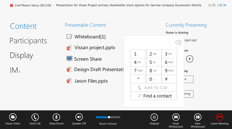
When I first got hired on at Skype I was brought in to maintain and improve this product called Lync Room Systems. Which is essentially a $100, 000 system a company buys: a three, 65″ screen conferencing device with microphones on the table, touch screens in the front and on the desk, cameras, speakers and more. When I came in it was pretty much designed but it was a new type of space that no one really knew how to make. You aren’t only working in the user interface of the touchscreen (and this was a three screen app). So we faced very interesting problems with a large touchscreen at the front of the room. What if the users are 4’10”? So I can’t put buttons at the top of the screen. With 2 screens: how do I drag something across? There are so many design scenarios to address.
What was your design role in Microsofts’s Lync Room Systems?
When it was developed it was meant to be for scheduling your online meeting: you schedule it and then come in and click on the big blue tile. When we went out and talked to customers it was clear that the function is good sometimes, but most companies don’t really schedule online meetings–they just kind of call-in someone on the phone. So I had to implement a dial pad so they could use the phone in the way they were looking for. I worked on a lot of aspects of this project and a lot of our learning from this transferred directly to the Surface Hub project.
Tell us more about the Surface Hub.
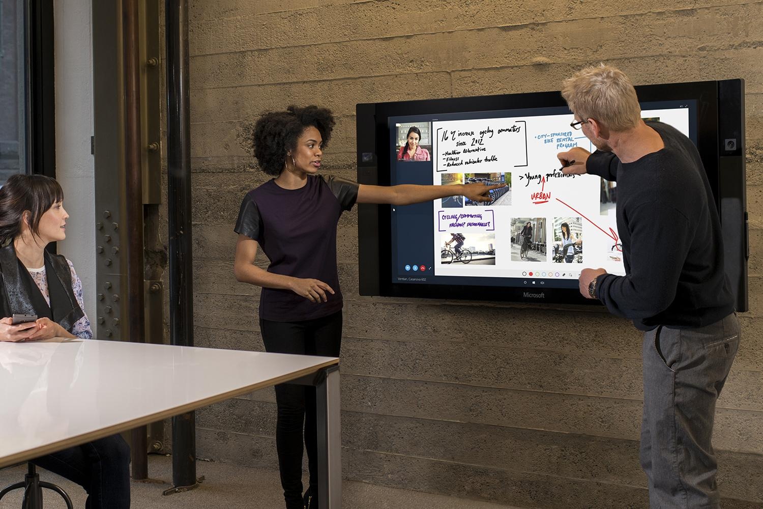
This is where it get really cool. Microsoft acquired some a company that essentially had the technology to create large touch screens that were to the level of using an iPad that is on the wall. They came to us and said: this is the hardware we are building, what would you do with meetings? So I’ve been a part of it since the very beginning.
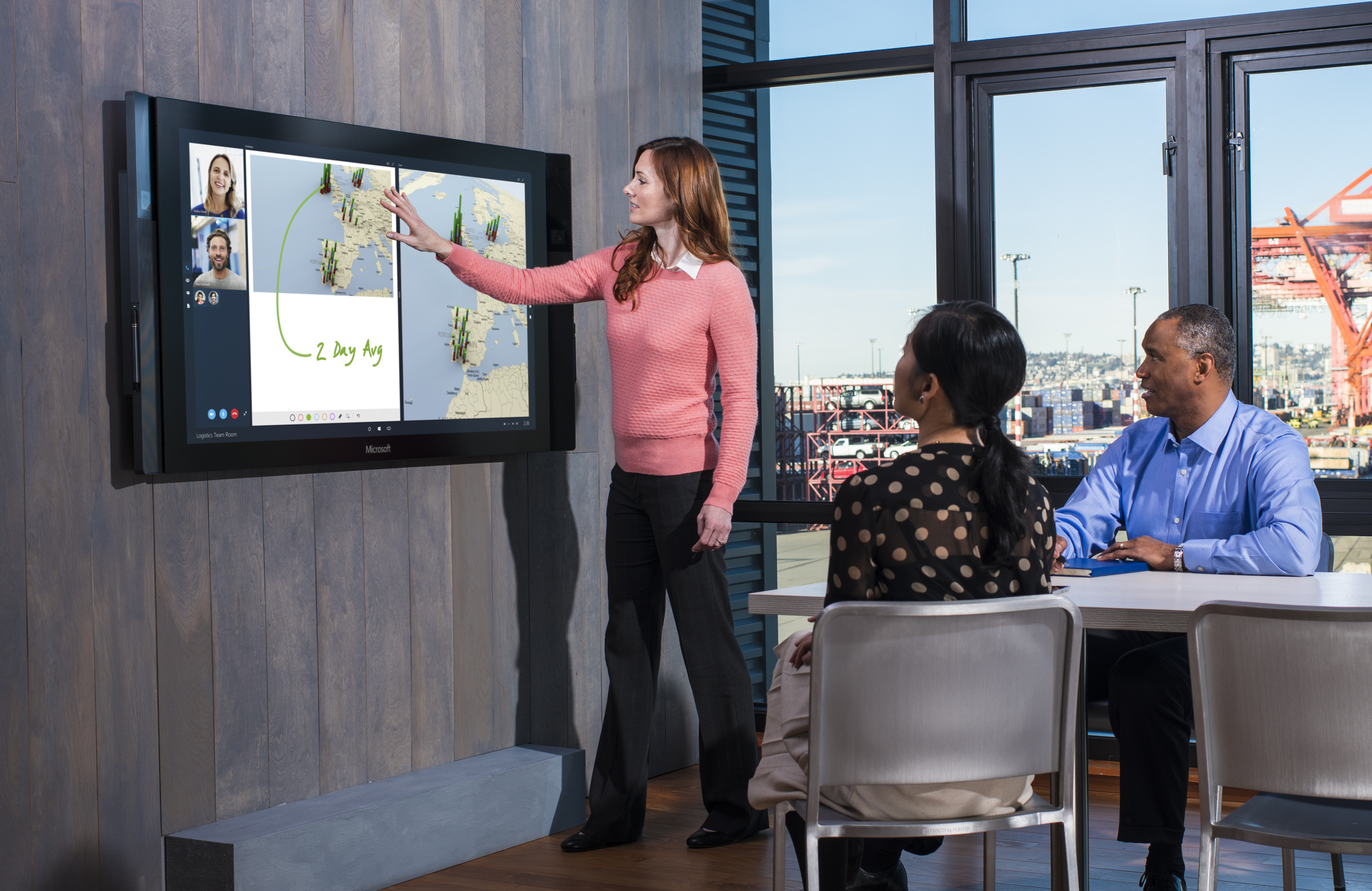
The team I’m on is the Meetings Experiences Team, we do work specifically around organized meetings and how the technology interacts with the space. There’s not just conference rooms theres also “huddle spaces” that are informal meeting spaces. Spots like a lobby could use one of these Surface Hubs. So we came at it in way that asked how do we design the software so that it will fit in each of these different locations. It was a challenge getting the text big enough to see from 30 feet back but also solving for the person 2 feet away from the screen that sees it looking gigantic.
We really wanted to design for a human interaction. See there is a little button under her arm? (see above) We have this strip (different sections of the app) on both sides of the screen so that if there are two people at the screen and one person wants to add a piece of content or just switch sides they have access at all times. Its just little things like that that just make it much more seamless for people in the environment that they are in.
Through Microsoft, you have worked on projects for ESPN, Major League Baseball and Xbox that were about bringing live, on-demand shows to Xbox. What was your work like?
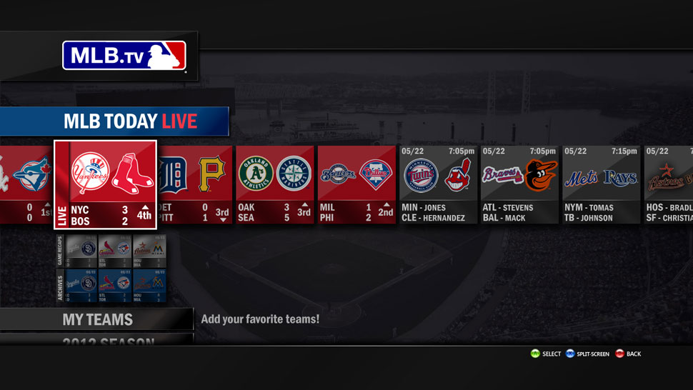
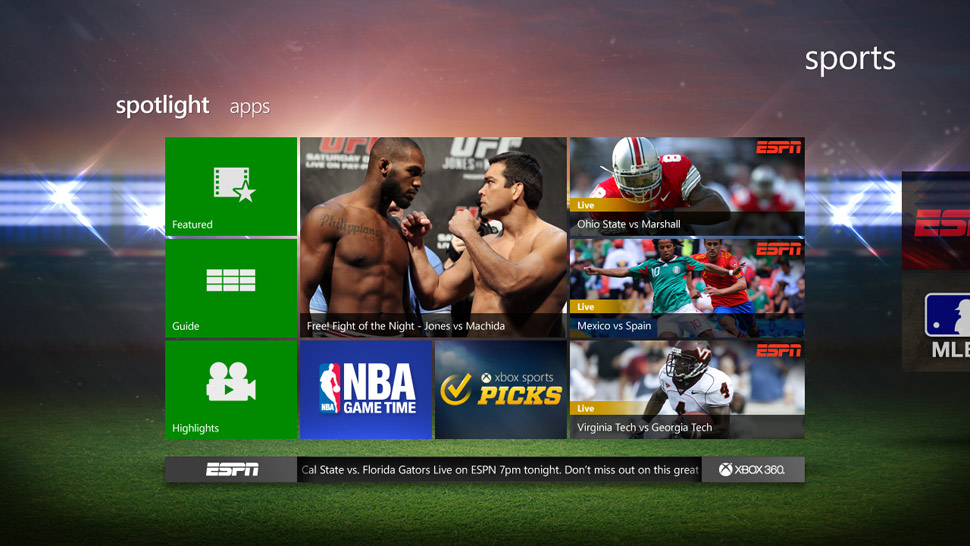
In the design process we kind of threw everything off the table and said: what if we did this based on what we know and made it all connect, made it hand-motion friendly and voice friendly. It is actually a very tough thing to do to make it accessible through the natural user interface inputs. We came back with something that was much more than a tv guide channel-changer and much more like a platform for showing live content.
It was a technical challenge to get the live video into the interface and we had to do research into how many videos people could watch at one time (turns out it is two). In term of interaction design, we were just taking it away from this strip view where everything just kind of rolls off the screen and up and down. Theres lots of limitations when you’re doing the gestures for Xbox–so we moved it to more of a stepped process. It was a bit of an information architecture problem: what are the four best tile steps to get to the desired content? And so on.
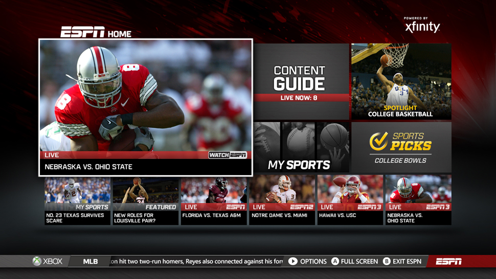
It was more of a technical challenge than a design challenge because you have all these different apps that not only pull from different sources so we basically had to build in a third party service that took in all of that, convert it into a format we could read, and spit it back out as something we could give user interface to.
Think back to when you were a student: would you have been excited to do what you do now?”
The projects I am working on I would have been very excited to work on. I’ve always thought I’d just do straight visual design work–I really love magazine layout. When I got my first job at Microsoft as a production designer I started doing a little UX work and thought “I really like this interaction stuff. This is really challenging, fun.” And I just left the visual behind for the most part. It is about putting yourself in the users shoes and seeing your own work through someone else’s eyes and really trying to figure out what to add in or cut out of it that really helps them. It is going from gray boxes on a page to this thing people are playing with around the world–that is really satisfying.
Check out more of John C. Bradley’s work on his website johncbradley.com.
