
Emily Irelan’s blog documents her time as a student. Her design style is frank, her writing style self-effacing and pithy. And she doesn’t shy away from use of expletives to make a point. When looking at her work, her style shows though loud and clear: bold colors, chunky display type, and attentive use of every inch of space. With web presence being critical for designers to show themselves, their thinking and work to the broader design community, she shows a dimensional view of herself. We chatted with her to get a sense of the impact of blogging has had on her first year of design school at SCCA.
Why is it important to you to blog?
I use blogging as a way of visually documenting my life. I like to be able to look back at things I’ve made and remember what was happening in my life at the time. It’s also nice to be able to see how I’ve improved or grown as a designer/artist, or to draw inspiration from past projects when making current work. So mostly I do it for myself, but it’s also a good way to show other people what I’ve been working on – I’m pretty sure my mom is my number one follower.
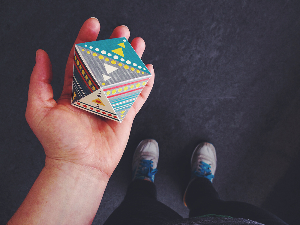
Packaging design.
What was your favorite project? Or a blog that you feel worked and why?
My favorite project to work on was probably the See America campaign (brochure, poster, and website) for Voyageurs National Park, but I think my most successful blog post was one I did for a first quarter class titled, “A Graphic Encyclopedia of Snow White.” I did a really thorough job of going through my creative process with this project, and I think that made the blog post more engaging than some of the others I’ve done.
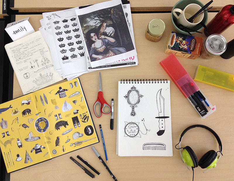
Irelan documents her process to show the path of inspiration to the final product.
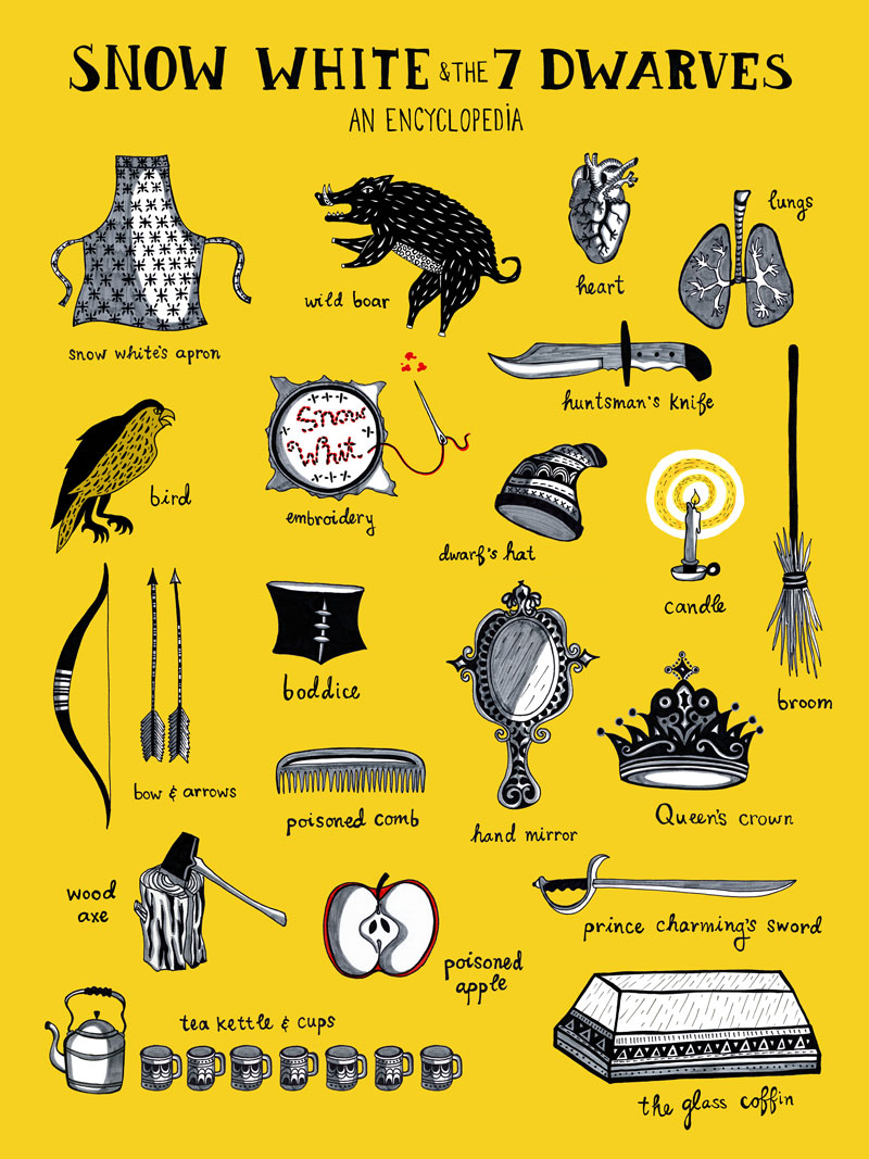
Irelan’s final piece, an homage to the style of Isabel Greenberg’s “The Encyclopedia of Early Earth” with content from the story of Snow White and the Seven Dwarves.
How has your blogging impacted your development as a designer?
I think it’s helped me learn how to talk about my work and present it to an audience (although this is an area I think I still need to work on).
What are some blogs that you check out and what is it that you like about them?
I really like Bonjour Celine (by Toronto based photographer Celine Kim) because I love her photography, and I also like the way she blogs about her professional work as well as her personal life. I feel like it gives a full picture of her as a person, and I kind of feel like I now her now.
I also love Humans of New York for the glimpse you get into the lives of such a diverse group of strangers. It’s a very powerful blog. Sometimes it makes me cry.
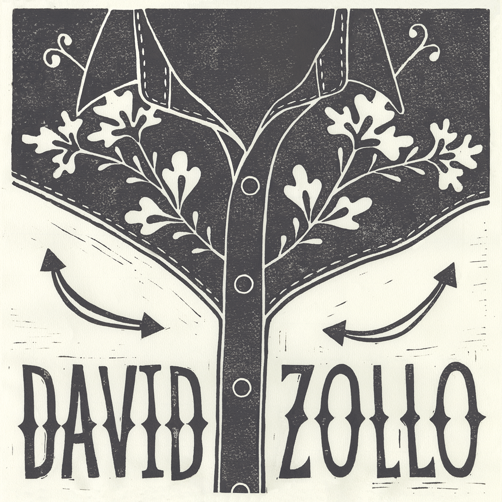
Album cover artwork for musician David Zollo.
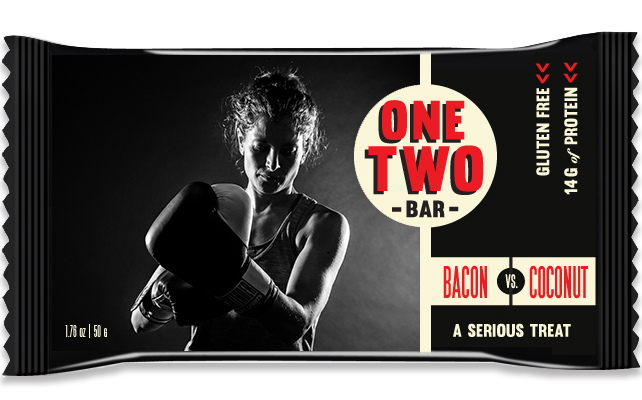
Packaging design for a energy bar geared for boxers.
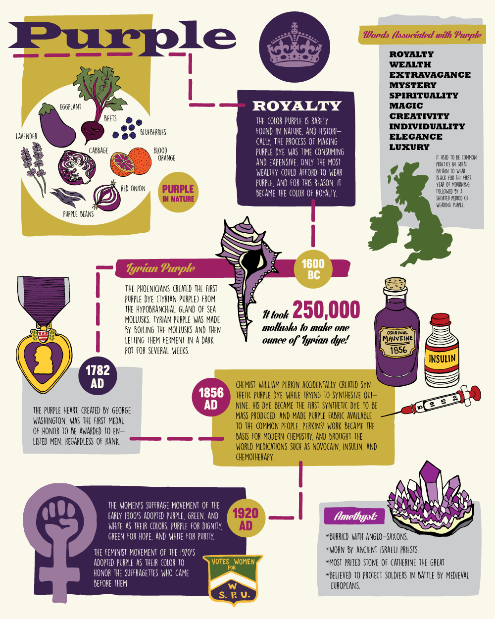
Info and illunstrations about the color purple.
Where do you go for inspiration and why?
The interweb. So much good stuff on that interweb. I also have a thing for signs (hand painted, neon, billboard, etc), maps, and old books.
Plans for your future in the blogosphere?
Just keep documenting.
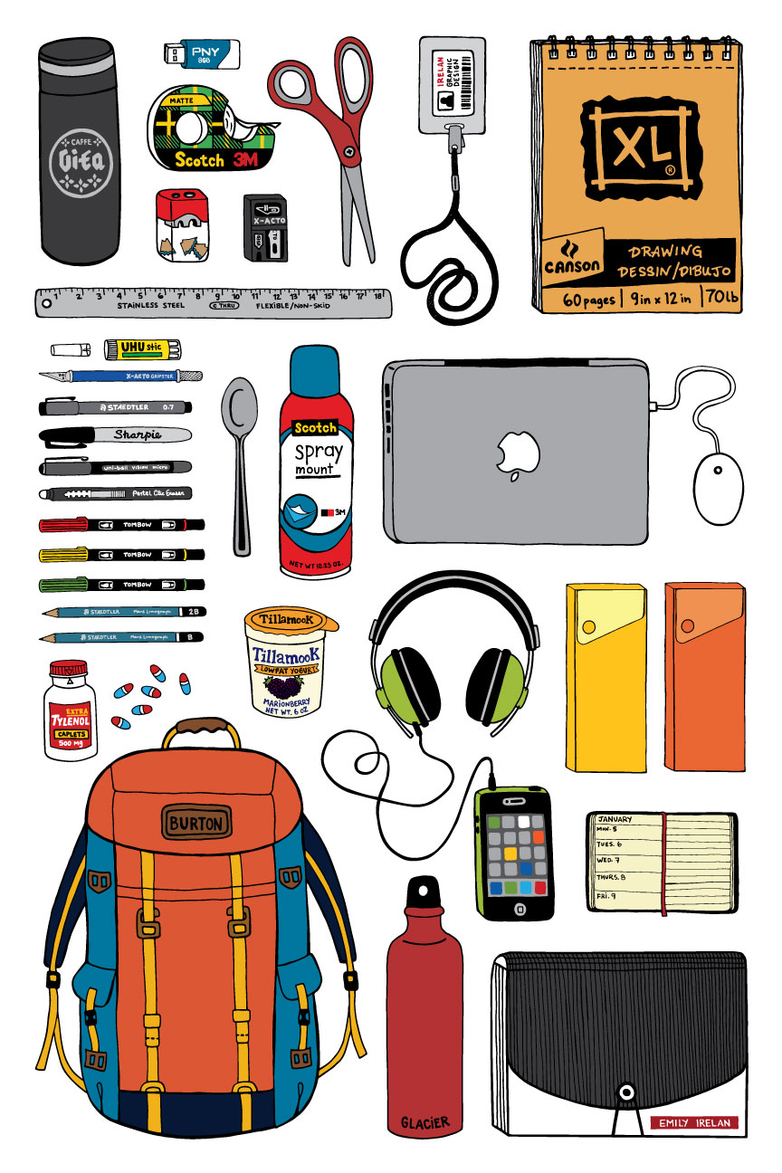
Check out Emily Irelan’s bog The View From Up Here at seattlecentralnewmedia.com/irelan.