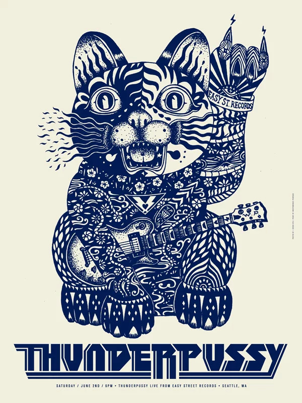
We are excited to announce that local artist and designer Shogo Ota will be joining SCCA to teach the second year Poster Design class. If you don’t recognize his name, you’ve seen his work somewhere around Seattle: on the Stranger, in Starbucks, or at your favorite restaurant. Shogo was kind enough to answer a few questions about his life and perspective. Join us in getting to know the Creative Academy’s newest professor!
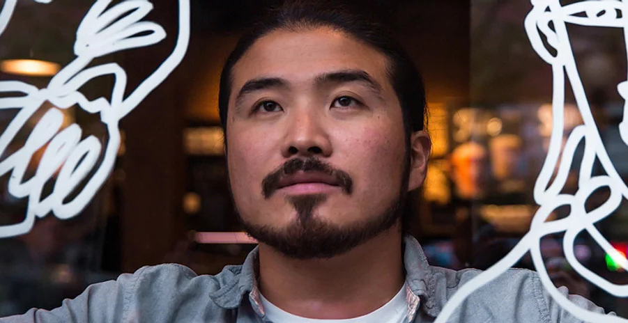
Shogo Ota will begin teaching at SCCA in Winter Quarter 2021. He is pictured here at work on a custom mural project at Starbucks.
How did you become interested in graphic design?
My major was business economics. I went to University of Idaho and I wasn’t really sure what I wanted to do after I graduated. First year, I was thinking: “I’m going to take business classes for the rest of three years…I don’t know if I can do that.” And one of my friends told me I looked like I could be a designer and I thought “that sounds so cool!”
I was thinking, “there’s no art companies when I graduate, but there are graphic design companies—a bunch of them.” So I did more research and learned programs—you know, the Adobe programs. Luckily, I got internship opportunities in Seattle—at Modern Dog—and that was my best experience to become a better designer and I could start my own studio because of that.
How was that your best experience?
Just working for a company is totally different from a school experience. You guys have a much better system and curriculum than a four-year college—I think—because I was taking painting classes and a printmaking class. Skill-wise, that’s good. But, if you belong to some company, if you do a bad job—it sounds really bad—but you get fired. You always have to get A’s: every day, every year, every month. And there are other coworkers who might be better than you and you think, “I’ve gotta be better than that guy!” Or, you know, “I’m gonna be the one who gets laid off in a couple months.” That’s kind of a scary feeling, you know? But that kind of “good pressure” and also being a really, really professional field.
And I was trying to pay attention how this company was running: how to invoice, how to communicate with the client, how to make revisions. I was trying to pay attention to those details that I didn’t have a chance to do at school.
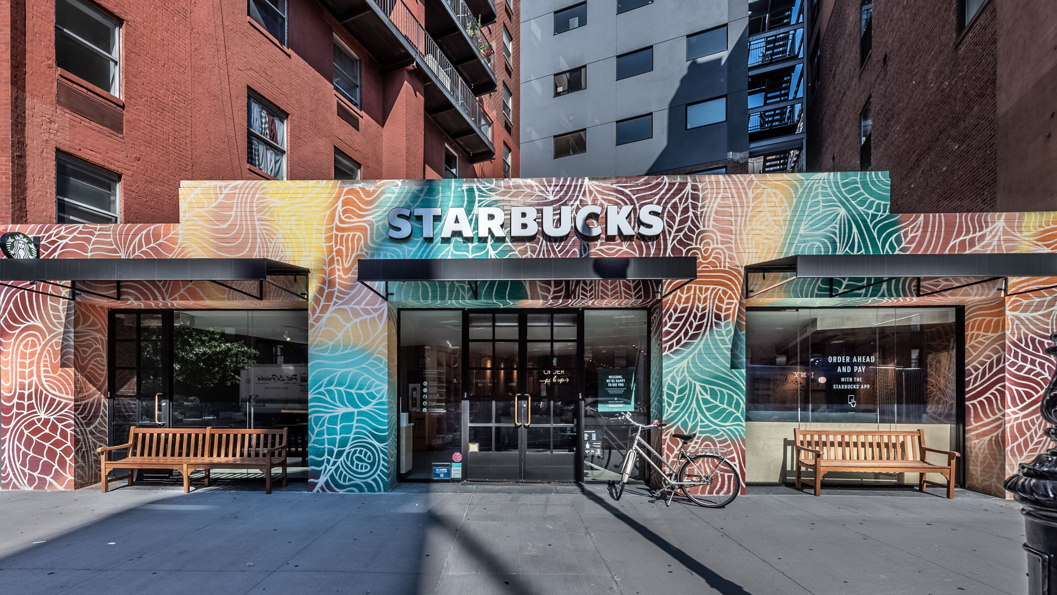
Shogo’s most recent mural project for Starbucks, in New York. His lively illustration covers both interior and exterior surfaces.
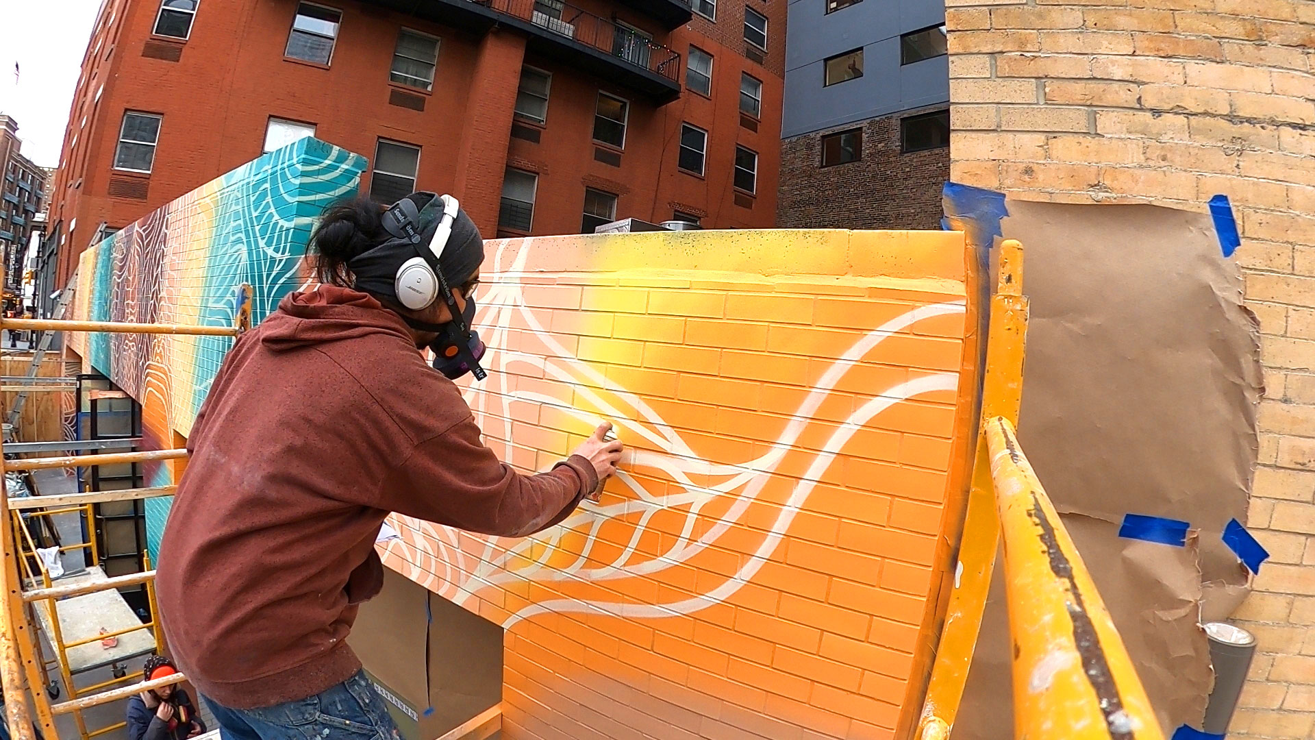
Shogo is known as an artist who is as adaptable as he is prolific. He experiments constantly with different media and techniques. Image: Maciej Glac.
Was there something in college that changed your view of graphic design?
Yeah, when I started, I didn’t even know the difference between art and design, for example, oil painters versus graphic designers, you know? Graphic design is more commercial, you have a client. And it’s not like you can do whatever you want to do. There are lots of different parts that I have to think about. What kind of direction, a target audience, and define the ideas, how to present. Those kinds of small things were pretty new to me when I took that basic class.
How old were you when you came over from japan?
Eighteen.
What brought you over?
Well, this is another funny story. I was going to go to college in Japan. It’s like SCCA: there’s only one time a year that you can enter. And the exam is really hard. You have to study the whole year for three to five subjects, but I failed everything. I failed at five or six schools—I just didn’t pass. So, my mom used to study abroad, somewhere near San Francisco. Before I even took those exams, she said, “If you fail, you should go to the US and learn a different language and culture.”
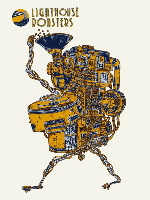
Although he is from Japan, Shogo might as well be a Seattle native: his style has become an integral part of the city’s visual landscape.
Have you taught anywhere else before?
Yes, I was an assistant teacher at Cornish a long time ago, because my old bosses—Mike and Robin—they both used to teach there. I was an assistant there a couple of times. And a couple classes at SVC. I did that for two or three classes. And then I taught at AI. That school is gone now: that’s why Marc invited me to do the [SCCA] class and I was like, “A music [poster] class, it sounds really fun and actually pretty deep.”
How are music posters special for you?
I have been doing lots of music posters, starting 10 years ago. At the time, I was just making them for Sasquatch Music festival as part of my job. It’s really good exposure as an artist because lots of people pay attention and buy prints. And then, suddenly, bands start asking you, “Hey, can you make a poster for us?” or “Can you make a logo for us?” And I’ve made a bunch of friends by now, pretty big artists in Seattle—and nationally. That creates really, really good connections. If—only if—you are doing well, as a good artist and also as a good person, I believe. And if anyone is thinking of becoming an independent artist in the future, after the experience of working at a company or something, that really helps: good connections and people knowing you, you knowing people. Music posters connect lots of different jobs and people.
I want to share this kind of story with students, too: I don’t know if you’ve seen the Starbucks cup I created. That, actually, came from a really small, local poster and that became the green cup, for me. That [small poster] project brought me a bunch of projects. Still, right now—on a weekly or monthly basis—I still get gigs from that. Any small or big project…if it’s small and you do it half-assed, I don’t recommend that. All in—or all out.
What’s the story behind your Tireman logo?
That’s Stranger newspaper cover art. I just made random art when I was working for Modern Dog. Just, making some collage or mixed-media art. And I just thought, “This kinda looks cool,” and I sent it to the Stranger. And they were like, “That’s cool! Can we use that for the cover design?” And I said, “Yeah! Go for it!” and I made it my company name. It’s a bunch of tires stuck together and it has arms and legs. I was too shy to use my own name for my studio. My website says “Shogo Ota” right now, but my actual company name is Tireman Studio LLC, so I decided to use that guy as the logo and name.
Who do you look to for inspiration? Who’s going cool work?
So many great artists, even just in Seattle. I’m obsessed with this Korean-American guy, David Choe. He does really good graffiti—spray painting—to watercolor, oil-painting and mixed media. He’s out there, he’s a crazy guy—in a good way. Great artist, he does everything. For the brush drawing side, the Gonzo guy, Ralph Steadman. Actually I have a print with his autograph on it. I like his style as brush drawing—a crazy, brushy style.

Shogo rarely does the same thing twice. He hopes to encourage students to dare to explore new territory in their projects.
What do you want to bring to the table for the upcoming poster class?
For this class, I’m thinking: I want students to explore and try different things. Because students are still students and I think there are so many opportunities—and time—to try different things. There are so many things you can do just making one poster, so I want students to try. I may even make my curriculum like that: if you use pen drawing, next time, you cannot use it. Just use, maybe, brush, maybe watercolor, maybe mixed. Just try to make different things to connect, to have fun. They might be able to find really cool things. I still, sometimes, go outside and pick up some branches and dip them in ink and try to make some interesting textures. There’s so many opportunities and possibilities. So, hopefully, students can see that, see what I do. I want to bring actual posters in and show students how I built it—from sketch to finish. Maybe screen printing, too.
Cool, thanks so much!
Of course!
