Seattle design firm Civilization took two out of ten spots on the 7th Annual Logo Design Awards Reader’s Choice list from HOW Magazine. Logos and identity application were selected from a national pool, and the public can vote through 11.18.15 midnight. HOW’s Logo Design Awards, presented in collaboration with F+W Media (who publish of Logo Lounge 9) aim to recognize the best of great logo design and honor the critically important nature of that area of design.
Civilization is “built on a collaborative foundation by Michael Ellsworth, Corey Gutch and Gabriel Stromberg” and in addition to creating nationally recognized identity work they are highly invested in growing the design community. With an annual design lecture series bringing people together and an influential “Death Over Dinner” series, they are leaders in moving the creative community to take on bigger, more meaningful work. SCCA graduate and Civilization Creative Director Gabriel Stromberg is highly involved in the identity development work that garnered HOW magazine’s attention.
When asked his thoughts on the nomination, Stromberg said: “We are honored and appreciative to have our work recognized. I was most excited to tell our clients about the news—we had such a great time working on these two projects and I think it definitely shows in the final product. Our studio’s branding process really begins and ends with storytelling. Our aim in all of the identities we create is to listen to our clients’ stories, and then tell their stories back to them through visual language. We were thrilled to see these two logos recognized on a national level as they both had such unique branding journeys. ”

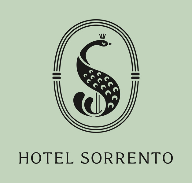
Hotel Sorrento
One of the logos in HOW’s Logo Design Awards is for Seattle’s iconic Hotel Sorrento. Stromberg shared about the process behind the design:
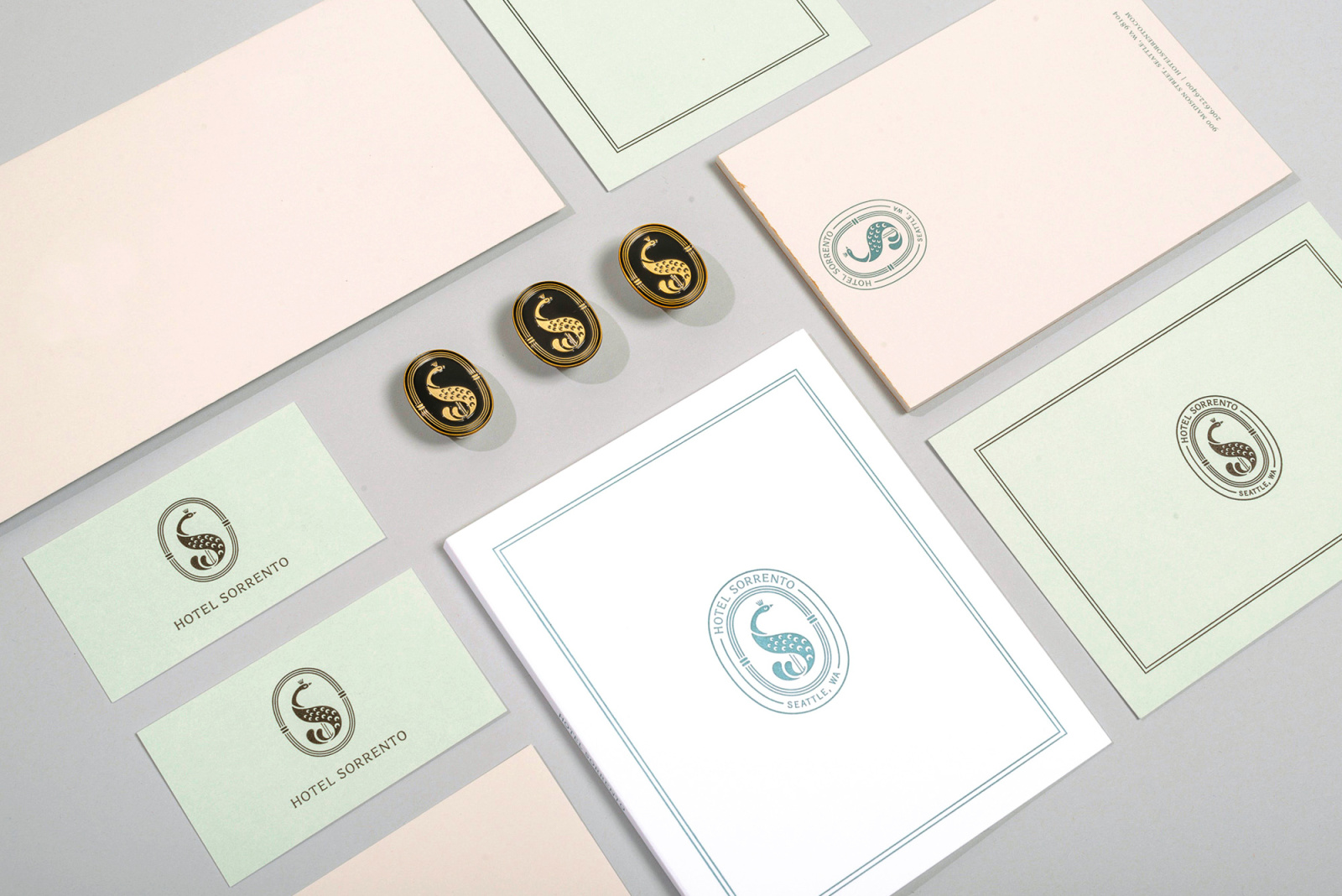
“In creating the identity for the Hotel Sorrento, we wanted to enliven the spirit of the hotel and drive home its uniqueness with a fitting-mascot. For inspiration we studied vintage publishing house colophons and matched a shade of green drawn from a vintage book cover. The Sorrento attracts the movers and shakers from the arts community, patrons who dress to be seen and speak to be heard – evoking the spirit of a peacock. We were also inspired by the mythology of the peacock as well – its tail holding the many eyes of the cosmos and acting as a symbol of immortality – which pays homage to the hotel’s impressive longevity. In creating the logo’s border we were inspired by art deco to reference the end of art nouveau. So there was truly no detail from the hotel’s history that didn’t end up playing a part in the final identity.”
Civilization had this to say about the work behind the logo:
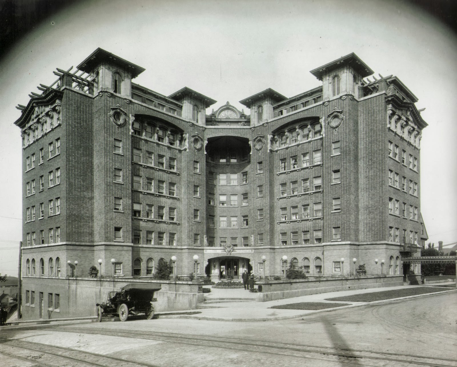
“The Hotel Sorrento first opened its doors in 1909, at the tail-end of art nouveau and just before the Alaska-Yukon-Pacific Exposition, a world’s fair held in Seattle to highlight the development of the Northwest. In the last century the hotel has seen many changes, but it has always remained a cultural hub and held strong ties to Seattle’s literary community.
The original dark woodwork and marble flooring that remain give the hotel a library feel. In creating the identity and branding for the hotel, we wanted to enliven the spirit of this Seattle landmark and drive home its uniqueness with a fitting-mascot.
For inspiration we studied vintage publishing house colophons and matched a shade of green drawn from a vintage book cover. The Sorrento attracts the movers and shakers from the arts community, patrons who dress to be seen and speak to be heard – evoking the spirit of a peacock. We were also inspired by the mythology of the peacock – its tail holding the many eyes of the cosmos and acting as a symbol of immortality – which pays homage to the hotel’s impressive longevity. In creating the logo’s border we were inspired by art deco to reference the end of art nouveau.”
Orleans + Winder
Civilization worked with Detroit-based designers to create the striking logo. Stromberg descibes the design process with Orleans + Winder:
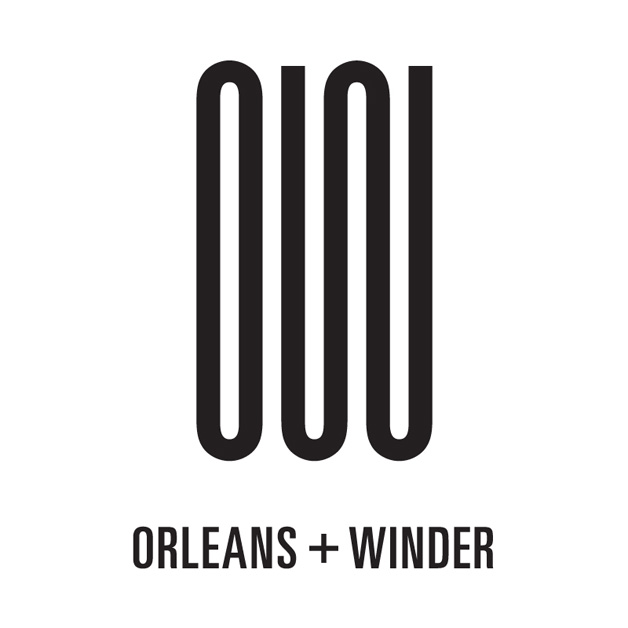
“Creating the identity for Orleans + Winder had a completely different journey. Orleans + Winder is a new fashion retailer based in the creative center of Detroit, they took their name from the cross-streets where their showroom resides. Taking the Orleans + Winder initials “O” and “W” we formed a logo that gives the appearance of an uninterrupted winding road, paying homage to the intersecting streets. In creating the lettering we took inspiration from the brand’s gritty, industrial noire-looks paired with their minimal, stripped-down aesthetic.”
Civilization had this to say about the development of the logo:
“Fashion and design purveyors Orleans + Winder are named for the cross-streets where their showroom resides, in the creative center of Detroit. Taking the Orleans + Winder initials “O” and “W” we formed a logo that gives the appearance of an uninterrupted winding road, paying homage to the intersecting streets. In creating the lettering we took inspiration from the brand’s gritty, industrial noire-looks paired with their minimal, stripped-down aesthetic.”
Congratulations to Civilization and Gabriel Stromberg for the hard work and well-deserved accolades. You can view the other entries and vote here.
